Reading your dashboard
What every panel, figure, status, and color on the Spendrein dashboard means — top to bottom.
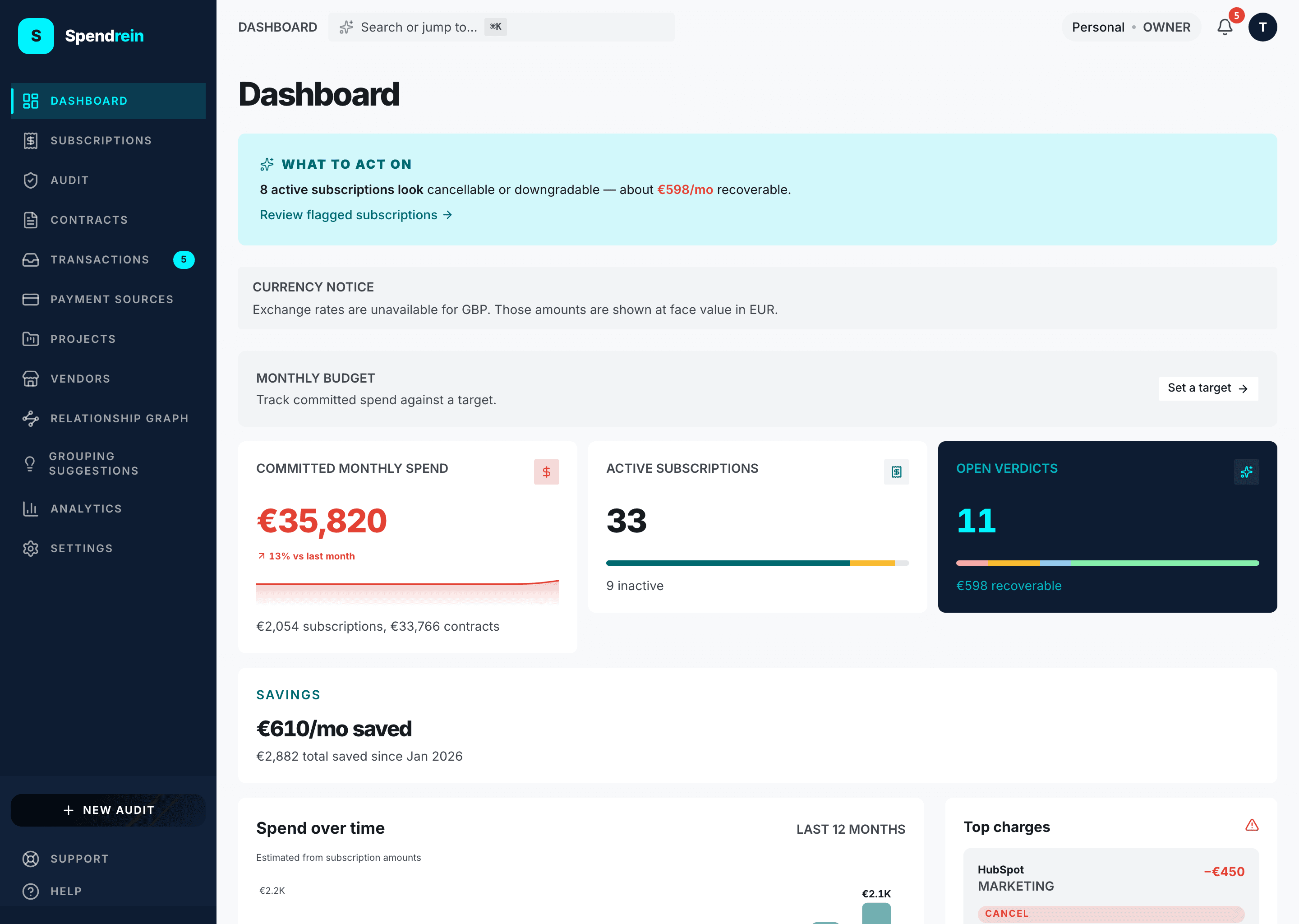
The dashboard is your at-a-glance answer to one question: where is money going, and what should you do about it? It reads top-to-bottom from conclusion to detail — the thing to act on is at the top; the supporting numbers and history are below.
Everything on this page is computed from the subscriptions and contracts in your current workspace, normalized to a monthly figure and converted to your display currency. The dashboard surfaces recommendations — it never cancels or changes anything on its own.
Before there's anything to read
On a brand-new workspace the dashboard shows a single prompt: upload a bank or card statement. Until your first audit finishes, most panels stay empty and a short "Your first audit is running" note appears under the title.
"What to act on" — the headline band
When the AI has flagged at least one active subscription to cancel or downgrade, a highlighted band sits at the very top:
3 active subscriptions look cancellable or downgradable — about €42.00/mo recoverable.
- The count is how many active subscriptions carry a
cancelordowngraderecommendation. - The recoverable figure is the combined monthly cost of exactly those subscriptions, in your display currency. It appears only when that total is above zero, so you can still get the conclusion even if the amounts are unknown.
- Review flagged subscriptions jumps straight to the subscriptions table, pre-filtered to the same set.
If nothing is flagged, this band is hidden — that's the dashboard telling you there's nothing urgent.
Audit in progress
If an audit is still running (just submitted, or processing in the background), a progress banner shows the count and the file name. Results flow into the panels below as soon as it finishes — you can leave the page and come back.
Monthly budget
If you've set a monthly budget (Settings → Workspace), the budget bar shows your committed monthly spend of your target, with a state label:
| State | When | Color |
|---|---|---|
| Within budget | under 80% of target | teal |
| Approaching budget | 80–100% of target | amber |
| Over budget | at or over 100% | red, with a striped overflow slice |
No budget set yet? The same row shows a quiet "Set a target" prompt instead, so the metrics cluster always has a consistent first line.
The three KPI cards
One shared definition: committed monthly spend
"Committed monthly spend" is the monthly-normalized total of your active subscriptions plus active contracts, in your display currency. A yearly plan is divided down to its monthly share. This is the same figure the budget bar and the analytics page use.
Committed monthly spend
The headline spend number. Its detail line splits the total into
… subscriptions, … contracts so you can see which side dominates. The
trend arrow compares the last full month to the month before it:
- Down is good — it renders in the positive (green) tone.
- Up renders in the bleed (red) tone, with a
…% vs last monthlabel.
The sparkline traces the last 12 months of spend.
Active subscriptions
A count of subscriptions you're currently tracking as active. The detail line tells you how many are inactive. The small segmented bar underneath breaks the full list into:
- Active (teal)
- Needs review (amber)
- Cancelled or dismissed (grey)
Open verdicts
The number of active subscriptions with an actionable AI recommendation —
that's cancel + downgrade + consolidate combined. keep and
uncertain are deliberately excluded from the big number (they're not work to
do), but the segmented bar below shows the full distribution including keep.
The detail line adapts to your situation: the recoverable amount when there's spend to claw back, "All recommendations are 'keep'" when everything's fine, or "Run an audit to see what to cancel" when there are no verdicts yet.
Spend over time
A 12-month chart of total monthly spend, driven by the same data as the analytics page so the two always agree. Use it to spot the shape of your spend — a steady climb, a one-off spike, a step up when a new tool landed.
Top charges
Your five biggest active recurring charges, largest first. Each row shows:
- Vendor and category, with the monthly amount on the right. Flagged items
(cancel / downgrade / consolidate) render the amount in red with a leading
−, signalling it's spend you could remove. - The AI verdict badge and a one-or-two-line reason.
- A 10-cell bar where each filled cell is roughly 10% of the largest charge — a quick visual of how this item compares to the top of the list.
A warning triangle in the panel header means at least one of your top charges is flagged. Click any row to open that subscription's detail page.
Recent activity
A rolling feed of the last 30 days — completed audits, new or changed subscriptions, and notifications — so you can see what moved since you last looked.
How verdicts are colored
The same five categories appear across the dashboard, the subscriptions table, and the top-charges panel:
| Verdict | Meaning |
|---|---|
| Cancel | The AI thinks this subscription can be dropped. |
| Downgrade | A cheaper tier likely covers your usage. |
| Consolidate | Overlaps with another tool you already pay for. |
| Keep | Worth the spend — no action suggested. |
| Uncertain | Not enough signal to call it. Not counted as actionable. |
The numbers, the currency, and what's missing
Amounts are normalized to a month and converted to your display currency (set in preferences). If a currency can't be converted — no exchange rate available — a notice appears and those amounts are shown at face value rather than silently dropped.
Running an audit
What a Spendrein audit does, which statement formats it accepts, how long it takes, the statuses it moves through, and the five recommendation categories it assigns.
Reading your insights
How to read every chart, KPI, and panel on the Spendrein analytics page — what each one means and which ones are actually actionable.